Tuesday, 29 May 2018

A look at our first outdoor space (and why we LOVE it)

Hello my friends! Welcome to the end of May -- can you even believe it? We've skipped right over spring here in Indiana and it's felt like the end of July for the past two weeks. I loathe the heat -- and so begins the summer "slothdom" I talk about every year.

I am not usually very productive in the summer, although I'm getting better. Last summer was full out CRAZY because our move happened so fast. I'm looking forward to a good mix of relaxation and productivity this summer!

Speaking of relaxation, I thought it was time I shared our favorite spot "in" the house lately. This one is actually outside, but it's a space we're spending a TON of time in. It's funny, because our backyard at the old house was just amazing. We added and added to it over the years to make it a beautiful oasis:
Paver patio with stone fireplace

Wood pergola on deck with lights

If you'd like to see everything we did in the old backyard, be sure to check out these posts! We worked on it for years! 

I mentioned before that there's very little we miss about the old house, and that has surprised us. Our backyard was just so pretty and magical, and we do miss it a bit -- but we know our future yard will be just as beautiful someday. 

What we don't miss is the upkeep. I didn't realize till we moved how much work it was to keep all of those outdoor spaces up. When we would entertain in the warm months we'd spend a good hour or more sweeping the deck, cleaning up cushions and pulling weeds from the paved patio. Obviously we'd do that plenty all year, but those are the times I really remember. 

I told my husband from the start in our new house -- no more decks and no more paver patios in this backyard. I don't want the upkeep of wood anymore and no more weeds that sprout in the patio (ours was worse than some I'm sure because it was surrounded by trees). I want basic concrete! That's it! ;) 

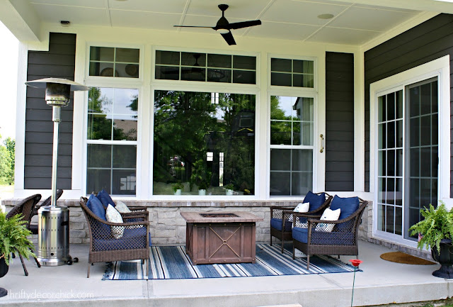
Anyway, I cannot even TELL YOU how much we are enjoying our new outdoor space. It's nothing super fancy, but we love it. We have a large covered porch and we had no idea how much we'd like this area:
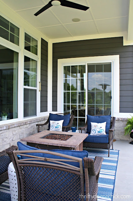
 Covered patio with tall ceilings

It's around 200 square feet, which we've realized is a perfectly lovely size for what we need right now. (The trampoline looks like it's in the house but that's the reflection. 😂)

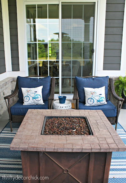
You know how I love symmetry! It won out here too, does that surprise you? :) I put our firepit in the middle and the four chairs on either side. It makes for an easy conversation area. There are two more chairs at the end of the patio that we can pull around the side as well. 

We sold our outdoor table that we had out here. We learned pretty quickly that we prefer to lounge in comfy chairs. :) 
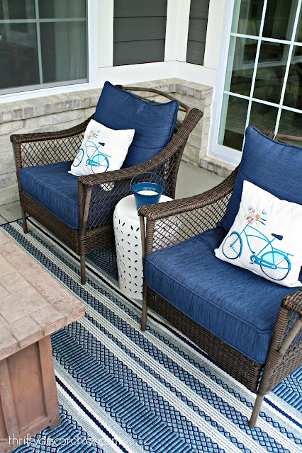
Blue, white and aqua outdoor decor on covered patio

We've had those chairs and the firepit for years -- both were from Menards. I need to spray paint the metal on the chairs sometime this year. I'll share all the sources at the end of the post if you're interested in anything!

I mentioned a few weeks ago how much we love having a sliding glass door. Actually, not so much the sliding door as the screen door. I've never had a screen door and it's been wonderful when the weather is nice. The cats are stationed there every minute it's open: 
Gas firepit for patio

Annnnd I just realized you can see Colby sitting there. Ha!! 

The only item I don't have a source for is the ceiling fan, but I'll do some checking. I love the little detail with the trim on the ceiling -- and that it's crisp white. I was going to paint it blue but so far we haven't had any bugs nesting up there! By the way, the fan helps tremendously with bugs when we sit out there. I had no idea it would help that much: 
Blue and white striped outdoor rug

We had speakers added so we can play music. We just haven't figured out how to do it yet. 😂 We also had cable and an outlet run for a future TV one day. That will be awhile I'm sure. 

I love how the big windows look in this space -- they're so pretty inside but make a big impact out here too:
Blue and white outdoor decor on patio

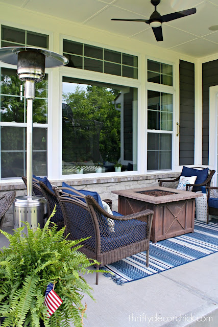
We'll put the heater away soon since it's hot as Hades most of the time, but we do still use it at night occasionally. By mid-June it will be stored away I'm sure: 
Covered patio with large windows

We also have a couple more chairs we keep at the end of the porch that we sit in when we take the dog out: 
Covered patio with ceiling fan

When our backyard grass grows in more we'll have him go in the back instead. Then I plan to move the chairs and install a wood swing. I cannot freaking wait! How cool will that be?

It occurred to me the other day that we've probably spent more time outside on this covered patio in eight months than we did the past two years at our old house on the deck or patio -- and we used those a lot! The shade is BLISS. Bliss I tell you!! We get a lovely breeze through here too so it makes it so comfortable even on a hot day.

It's not quite as pretty as the old backyard, but it's super functional (and we think pretty cool looking). We are enjoying this space so much and are so thankful for it:
blue and white outdoor decor

Our backyard is much bigger than our old one and much flatter as well. We have big plans for it that I hope to share with you soon -- it will be awhile before we get started on any of that though. The biggest part will be the patio and we don't have details nailed down just yet. It's fun to dream about how it will look someday! 

Do you have an outdoor area at your house -- covered or not? I always thought a screened porch would be lovely too. Do you prefer something out in the open like our old patio or something like this? Eventually we hope to have both but I really have fallen in love with the shade. ;) 

Here's a list of the items on our porch if you're interested! Affiliate links included for your convenience:

Cushions: Lowe's but these are very similar and a better price
Rug: Target
Firepit and chairs: Menards (probably five or six years ago)
Butane heater: Amazon (no longer available but this one is similar)
Pillows: At Home and Home Depot
Thermometer: Target
Planters: Goodwill (see how I spray painted them here)
Door rug: IKEA
White side tables: World Market


SaveSave

from
http://www.thriftydecorchick.com/2018/05/a-look-at-our-first-outdoor-space-and.html

Cottage kitchen and Living Room

Last week, we had looked back, to that time we flipped our rental house, and had taken a peek at the bathrooms. I wanted to look back at the cottage kitchen and living room, because it certainly didn’t start that way!

Cottage kitchen with white painted cabinets

The kitchen had been remodeled sometime in the 1980’s with those orangey oak cabinets. It also had a weird layout. I think the original owner tried to maximize cabinet space, but in the mean time, really ended up minimizing living space. The ceramic floor tile was cracked, stained and old, and the room layout was terrible.


We ended up pulling out all of the cabinets that had been on that far wall, including the refrigerator,and moving it to the main kitchen area. We also added a few new cabinets, and moving around some of the old ones around for a better layout.  You can see on the before picture, that there was counter top and a cabinet  where the fridge is on the after.

See more of the full transformation here.

We put down new floor, painted the cabinets, and added a new counter top. It became an entirely new kitchen! I know that sounds very magic wand-ish. It actually took several months, and about $6,000, and a lot of elbow grease. But, I will say, it was very satisfying and rewarding to see it become brand new, and alive.

Painted oak cabinets and a new counter top give this kitchen a nice update in this ranch remodel

Since the home was a ranch home, and the kitchen and living room smack right up next to each other, I decided to keep it light and bright.

Pretty cottage ktichen with mason jars for flowers

I really felt like they needed to be separate, but flow into each other, since when you walk in the front door, you can see right through to the back of the kitchen.

Farmhouse living room with beadboard wallpaper


We added french doors to keep it open, but separate the spaces slightly.


You can see the difference in the before picture, and you can see more of the projects here.

Oak house before cottage kitchen and living room

It’s amazing how simple changes can update an entire home. To me, interior decorating and design is like painting. It’s about putting pieces together, and then seeing what seems like it’s missing. Almost like a beautiful puzzle.

Cottage decor and vintage french doors as dividers

I loved the act of taking something that was so sad looking, and making it brand new. This house just needed  a cottage kitchen and living room, and some love, and it was ready for a new family.

At the shop, we’ve been offering interior design and decor since we opened, but it’s really started getting busy. I love how in every home we go into, a transformation happens. We are able to help a homeowner love their home all over again, most of the time using what they already have. To me, that’s the best part.

Thanks for taking a little stroll with me down memory lane!


The post Cottage kitchen and Living Room appeared first on Jennifer Rizzo.


from
https://jenniferrizzo.com/2018/05/cottage-kitchen-and-living-room.html
Thursday, 24 May 2018

I'll make art out of anything!

Hey all! Thanks so much for your kind comments on my last post -- I'm glad so many of you liked my wall project in the family room. It makes such a difference in there! 

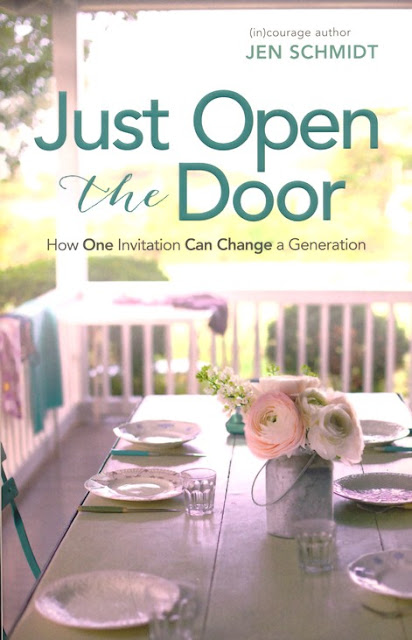
My friend Jen from the blog Balancing Beauty and Bedlam recently wrote a LOVELY book called Just Open the Door (affiliate). It is such a wonderful read about opening our homes to others without the stress and anxiety that sometimes holds us back from doing so. I've known Jen for nearly ten years and she is a beautiful soul. I was thrilled to get and read her book!
Just Open the Door book

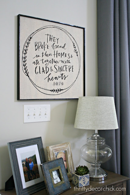
When she sent the book, the package included this lovely tea towel. I loved it but it felt like it wouldn't be seen quite enough just hanging on a rod in the kitchen. 

I had an idea to display it: 
They broke bread quote tea towel

I went to the hardware store and had a piece of plywood cut down to a 22 inch square -- only $5! 

When I got home I sprayed the heck out of the wood with this spray adhesive: 
Spray adhesive for craft projects

This stuff works best when you let it sit for a minute or so -- it gets extra sticky! 

I centered the towel on the board and any little bubbles I rubbed out: 
Making a tea towel into art

Then I grabbed my staple gun and secured the towel to the back: 
How to staple fabric around wood

Just be careful not to pull it too tight or the fabric and wording will get wonky.

On the corners I just fold it like I'm making the bed -- whatever you do just make sure it's not too bulky:
Wrapping wood with fabric to create art

This fabric is super thin so it was easy to work with. 

I put a few extra staples on the corners to make sure it doesn't budge:
How to use staple gun with fabric

Oh, and I usually cut down any corners if they're too bulky. 

I got more of my really thin pine trim I use ALL over the place to make the frame. I spray painted the pieces black and then used my nail gun to secure them around the sides: 
DIY cheap frame for artwork

If you try something like this make sure your large wood piece is thick enough that you can nail into the sides. 

That was it! It was a super quick project and I just adore it:
Using fabric or a towel to make DIY art

I hung it on a wall in the family room right by our breakfast room (the one I call the "morning" room)  since we don't have much wall space in the eating area. 

And YES, I KNOW. It's more words, ha! (Check out this post if you're confused.) But I just love how it turned out! There's no glass over but there's no need. I see pretty tea towels all the time that would make great art like this: 
DIY framed art using a tea towel or fabric

I will make art out of anything! I'm not picky. ;) And it cost me about $10 in materials. Can't beat it!! 

Have you framed anything unusual to create art for your home? You can check out all of the art I've made over the years by checking out these posts

I highly recommend Jen's book -- it would be a lovely gift as well. I'm thrilled for her and honored to help spread the word. :) 

Have a great weekend my friends!

SaveSave

from
http://www.thriftydecorchick.com/2018/05/ill-make-art-out-of-anything.html

Tuesday, 22 May 2018

The Pottery Barn look for WAY less

I'm excited about this project folks! It was a quick and easy and one of my favorite DIYs in a long time. And yes...it was in the family room. I know you've seen a lot of it lately! I didn't plan to do this so soon, but I did. So I'm sharing. 😉

Here's where I left you last week and I mentioned that I had a plan for that wall under the stairs:
Open wood staircase

It needed something -- I've had an idea for some time to fill the space and went ahead with it over the weekend. It was just hours before we were expecting company -- I ran to the hardware store for my supplies and threw these together SUPER fast!

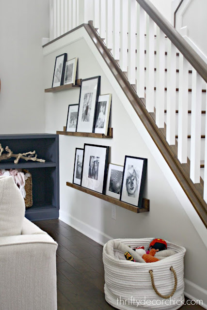
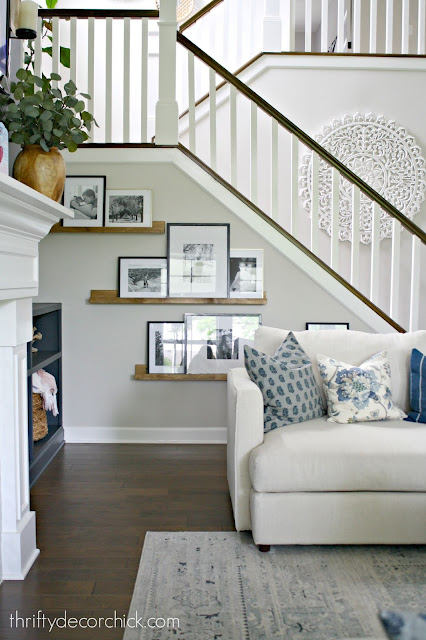
I've imagined some simple display shelves along this wall for months. I stuck some painter's tape to the wall to figure out the sizes of each one and get an idea of how it would look. I built three, four and five foot shelves for the wall. I wanted to go down low on the wall as much as possible because it just felt right visually to me. 

To build these you'll need three pieces of wood -- a 1x2, 1x3 and 1x4. You can also make it with a 1x4 on the bottom so it would be a bit deeper. I found the three inch to be fine but if you plan on leaning a bunch of frames I'd go with the four inch:
Easy tutorial for DIY picture frame ledges

I used wood screws from behind to secure the bottom piece to the back. Then I used my nail gun to secure the front trim to the shelf. 

I used wood glue on the front part along with the nails, but it's not really necessary. Just an extra precaution to make sure they don't budge when the frames push against them. But again, the nails would be just fine: 
How to make picture frame ledges

I stained them with the Minwax color Provincial because it works with our floors so well. I've used it on our butcher block island top and frames on various projects like this one

You can see here how they barely take up any space as far as the depth:
DIY picture frame ledges how-to

I marked where the studs were in the walls and then just screwed through the backs to hang them. I wasn't worried about the screws showing because I knew the frames would cover them. But if a couple show I'm not worried about it:
DIY picture frame ledges with pine

I got a few new frames from HomeGoods and used some I had. I printed out random photos from my phone on our printer at home. 

We absolutely LOVE it. My husband and son both came to me at different times saying how much they like it! When the men notice you know it's good! 😂 Shelves with leaning photos turned out to be a great in between -- not too busy because I kept the frames to the same shape and only two colors. But it fills in the space beautifully because I went low and filled the wall:
Pottery Barn picture ledges for a fraction of the price

It's nice to get your photos off the phone, right? I'm SO bad about that. I grabbed pics from recent trips and random snapshots and I love every single one! 

I especially love how they follow the angle of the stairs. It just makes it more visually appealing: 
Get the Pottery Barn look for way less!

We have plenty of space behind the sofas but this would also work great somewhere with less room just because they're not very deep at all. 

I'm so thrilled with these! I especially love that they were so inexpensive and quick. I made all three and had them hung in less than an hour. Now I'm thinking of where else I could add some! They would look great painted black or white too: 
Filling an odd wall space with DIY picture ledges

I spent $30-something on all three because I went with select pine (it doesn't have knots). If you used regular pine and don't mind a little more rustic look (or if you're painting!) you would spend maybe $20? Not even that probably. Not bad either way considering this one from Target is much smaller and priced at $13. And this four foot one from Pottery Barn is $129!! CHOKE. (Affiliate links.) 

I love when it comes together like it looks in my head! Always a bonus. Now, onto other spaces, I swear! :) 

Have you tried these simple DIY frame ledges? They give you that Pottery Barn look for way less. 


Check out more recent gallery wall ideas below: 
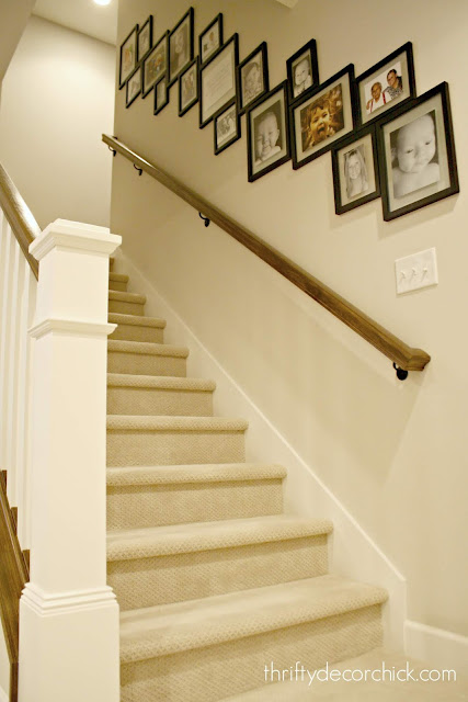
Gallery wall going down staircase


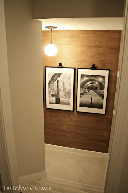
DIY wood stained wall with large frames


Photo wall around thermostat


from
http://www.thriftydecorchick.com/2018/05/the-pottery-barn-look-for-way-less.html
Thursday, 17 May 2018

Things with words on them

I noticed one thing in particular when we moved, especially as I unpacked our art. I had a LOT of things with words on them. Art, signs...whatever. Just lots of words. This trend has exploded over the past four years or so -- especially the farmhouse-themed signs. 

It wasn't until I saw it all together that I realized just how much I had. I wouldn't say our house was FULL of it, but it was enough. It was at least spread out pretty well! I've been making a concentrated effort to tone down the things with words since we moved in. I think it can get a little overwhelming if there's too much of it in a space.

But then! I'll find the cutest art that will look just perfect in this or that spot. And I've noticed I'm just generally attracted to cute signage. I find myself reaching for them more than anything else. And there are rooms that just tend to attract this kind of art...I've noticed our kitchen and mud room in particular: 
Pantry decor and organization

Especially the mud room! So many cute things with words for a mud and laundry room: 
How to make your own lettered signs

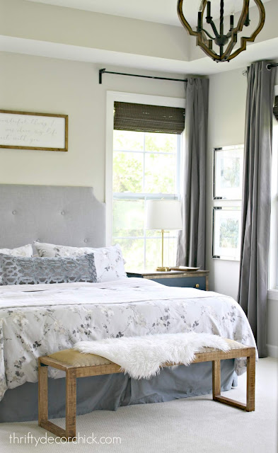
But I'm still determined to use some restraint when it comes to signage. But I've been looking for the right thing for over our bed for seven months now. Our ceilings are much higher over our bed in this house so what we had up before looked dinky.

I've tried four mirrors, other art...all kinds of things we already had and a couple I bought and returned. Then I saw a sale for scripted art on Facebook (those dang ads get me!!). I didn't see anything quotes that really struck me, until I saw this one:
Art for over the bed

If you can't read it, it says "The most wonderful thing I decided to do was share my life and heart with you." It wasn't too corny and actually made me tear up a bit when I read it. Truer words were never spoken. You can see what I had up before (and a tour of the whole room) here

I got the biggest size they made and everything was on sale. (I think they still are because I keep seeing the ad pop up.) I got this sign from a site called Smallwoods. I could have made this myself easy -- I've made many over the years. But I loved this script. And sometimes it's just nice to buy it!: 
DIY tufted headboard

I was looking for something at HomeGoods the other day and instead of what I was looking for I found some new bedding that I fell in love with. Our other duvet is a dark gray and heavy for the summer, literally and figuratively. 

I love the light tones of this duvet and I LOVED the sheets with it, but those are going. They are SO dang scratchy. I mean, it felt like we were sleeping on sandpaper. 😂 I thought they would soften up after washing, but no. And they're a little too small for our bed -- both big bummers because I love them together! Can I return washed sheets? Any tips for softening up cotton sheets that feel like burlap? :) 

So our old sheets will go probably go back on, but I love the way these look! 
DIY tufted headboard light gray

Light and dark gray bedding combo

The floral duvet cover is DKNY and the design is called Wallflower, I actually found a queen version on Amazon! The review says it's not soft but I find it to be very soft. The sheets are called Vintage Select and they had a ton of cute options, but they are not comfy at all. The blanket didn't have a brand name on it but was from HomeGoods as well.

Someday I'd love to replace the dark curtains with something lighter...but they have to be light blocking, super long and a decent price when the budget allows. I have a feeling that's not going to happen anytime soon. So for now I will continue to enjoy our perfectly dark room at night. ;)
Finding art for over the bed

The art with words won out! It's simple and meaningful and my husband loves it too -- score all around!:
Master bedroom with tufted headboard and art over bed

I have big plans for this room -- the wall behind the bed will get a treatment that will frame out the art and I want to recover the bench seat (it's actual burlap). ;) I also have plans for the tray ceiling. But these little changes are making this room feel lighter and prettier, perfect for the summer months! 

Are you a lover of art with words and sayings or no? I think they can be overdone for sure, but at the same time I think they are lovely in the right spot! 


If you missed my last post, check it out here!: 
Dark fireplace wall with DIY built ins


Affiliate links included for your convenience! 


from
http://www.thriftydecorchick.com/2018/05/things-with-words-on-them-yay-or-nay.html
Sunday, 13 May 2018

That Time We Did A Rental House Flip

A recent FB  memory came up about the time we did a rental house flip, on our own rental. THAT was a CRAZY year. That was the year (2013)our town flooded.  In fact, it was only a month after the flood, we were dealing with our own house, and the tenant had moved out, leaving extensive damage. To the tune of tens of thousands of dollars. We had no idea how we were going to afford it, but I knew if we could do the work ourselves, and stick to a budget we could do it.  That house was also the reason we got out of being landlords. We  had had rental houses for almost 15 years, and we were just over fixing another house,and having small kids, and not concentrating on our own.

For all of the headache, I actually loved working on it (and I would love to get another house that is a fixer upper.). I learned so much! I adore hands-on, and I loved being able to treat the house like a piece of clay. Though, I will admit, during the process, there were many tears, and panic attacks that ensued. I’d be lying if I said it was smooth sailing. People love the idea of having “properties”. To be honest, you can make money that way, but you can also lose money that way. And, they can be a huge headache.

I thought I would re-live it a littl,e and share the spaces. If you missed it the first time, these next few posts will be a great way to catch up!

Painted walls before and after.Great neutral

The back bedrooms were easy. Paint, re-carpet, and clean. You can see their before and afters here. The hard part was a teeny back bathroom.

Small bathroom make over before

It’s just a closet of a room, but the walls had something going on that was beyond reason. We just had no words. There were quite a few projects that went on,on a budget like the painted floor, painting the cabinets, and just making it prettier.

Small bathroom on a budget, adding subway tile

We carried a lot of the same things over like the faucets, and the subway tile, and kept the counter to save money.

The main bathroom was  an entire different animal. It was super-outdated with a tub surround, the floor tile was cracked,and it looked as if someone had been dropping bowling balls on it.

Small bathroom before renovation in a rental house flip

It was pretty rough. Luckily,the tub was in great shape, so we had that refinished, and everything else was completely gutted.

You can see some of the things we did here and here, and the entire process here.

Bathroom with white subway tile in bond pattern with gray grout

In the end, it ended up being a very simple, and clean looking bathroom. I remember buying the subway tile (remember it was 2013,), and the tile guy was like “This is so old-fashioned, nobody buys this anymore.” The tile itself was only about $200 in supplies, and it was super-affordable.

Bathroom remodel with White subway tile and beadboard on a budget

If he only knew the on-coming storm called Joanna Gaines, he might not have thought that. It’s funny that I was so ahead of the curve on that, but doing subway tile in my own house took so long... Aaaahhh…The shoemaker’s children syndrome.

It was fun to look through all of the old pictures, even though the rental house flip gave us heart palpitations at the time. It will be fun to walk down memory lane with you with the rest of the house.


The post That Time We Did A Rental House Flip appeared first on Jennifer Rizzo.


from
https://jenniferrizzo.com/2018/05/rental-house-flip.html