Hey all! I'm chugging away at projects around here and amping up for some big ones too. I'm trying to get our basement storage room under control before I start the big stuff though. I have this thing about messes and DIY -- it's hard to focus on a new project when I know there's a mess waiting for me.
Soooo...I've been busy getting organized down there because we have a bunch of decor/craft items I have to store for now. Until I build built ins in (my office will be first), I just have to deal with having so much down there. I get excited when I find a spot for something that we have stored in that room, and that's where this story began!
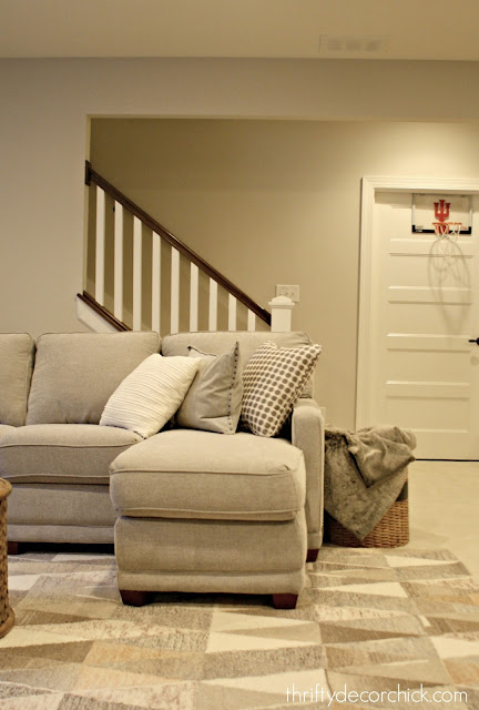
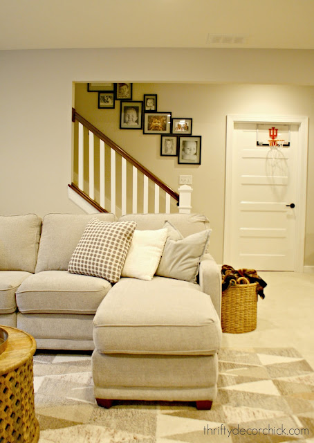
We have this large wall down to our basement that I wanted to do some kind of gallery wall on:
When I was organizing the basement I found these "floating" frames I used on our old upper staircase:
I've gathered them from Michael's over the years -- I think I had 12? I call them floating because the photo or art sits between two pieces of glass so you can see the wall color behind it. It makes it look like the mat is the same color as the wall.
I was planning to hang them on this wall in just a hodge podge like I used to do gallery walls -- I just hang them here and there until I like the way they look. But as I was sitting on the floor cleaning them, I got an idea.
I recreated it for you because I didn't take a pic when I first thought of it:
You can get the idea maybe? I didn't do the best recreating this shot. 😂 I had different sizes right up against each other in random design, by accident. What I really like about it was that they were touching and not spread apart.
It gave me an idea, so I started in the middle with this random printable I made years ago:
It's the only large square frame I have so I figured it would be best in the middle.
I didn't really take pics of the process because I wasn't sure till about half way through that it was going to work. But I started going down first -- and just kind of put the frames next to each other in a way that I thought looked good. I wanted them to touch but also wanted the whole thing to have some movement and not feel to rigid.
I was only a few in when I knew I'd need some more frames. I ran to Michael's hoping they still carried these frames and they did...and on sale. Awesome! I grabbed a couple more of a two sizes and threw in some small square ones as well.
This is where I tell you I'm not the girl that plans out a gallery wall. I know some people cut out paper in the same size as the frames and then tape them up to figure out a design that works. That's BRILLIANT. I am not that patient. ;) I would much rather fill a few (OK, more like ten) extra tiny nail holes after the fact.
I was SO thrilled with how it looked as I went down the stairs, I did some counting and realized I had the exact number I needed to repeat the same design going up. I mean, that never happens. NEVER. happens. ;)
Here's a peek of the wall going up now:
The only bummer is I went to copy new pics on the printer to make them black and white (to match the others) and our printer was out of black ink.
But you know...I don't hate the color photos mixed in! I may keep it this way:
If you really look you can see that the design going up is the same going down, just the opposite direction. (What was on bottom going down is on the top going up. Or something like that. I'm confused.)
At the end I did have to stand there and stare at it a for a few minutes to figure out what I was doing -- ha! It gets a little confusing when there's no real pattern to the frames:
I'm not as big into gallery walls as I once was -- I used to put them all over our house! I still love them but am finding I like them a little more structured than in the past.
I think this way of doing one feels crisp and keeps it from feeling too crazy busy. I mean, there are 17 frames on this wall, in five different sizes! And yet this design is soothing to me:
(Do you see my buddy on the stairs?) We just LOVE this!! I'm so thrilled with out it came out -- and it was a complete accident. ;) I really like that the frames touch.
Back in the day when I was a big gallery wall fan, I'd also use a variety of frames (so easy to find second hand!) in different colors. I still love that look, but for our home I now prefer using the same frame.
I mean...the mix of color and black and white is enough for me. ;)
Next up, a big project on that landing wall! Can't wait!:
Do you have gallery walls in your home? Do you prefer a more streamlined look like me or a more organic look with different colors and frames? I think this is a nice mix of the two!
I almost forgot! Here's a link to the frames I used -- they have a ton of different sizes online. They had four or five in the store. Michael's always seems to have their frames on sale which is nice. Especially when you're trying to finish a project so you can blog about it and you need to run and grab more. ;)
You can also see my small gallery wall I added around the thermostat in our small hallway!
I also added a simple one in our master bedroom:
from
http://www.thriftydecorchick.com/2018/03/a-different-kind-of-gallery-wall.html


No comments:
Post a Comment