Well hello there! I know my posting has been wonky lately -- we started summer vacation and it's been busier than I thought it would be! Things should be back to a normal posting schedule next week. :)
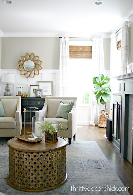
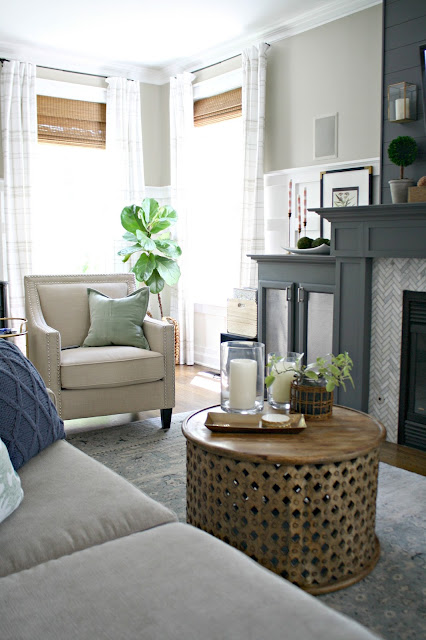
I'm so exited to share our mini makeover in the family room with you! I mean, it's not mini I guess, since we got a new piece of furniture. But overall I've just finished the space and moved things around, so they aren't huge changes. But I LOVE. :) I've been working on bits and pieces of this space since early this year. We picked up a couple inexpensive chairs that really brought the room together. I also changed up the drapes with lighter and higher versions that really brightened up the space as well.
I shared a review of our sectional earlier this year as well -- the store actually saw the post and offered new inserts which was SO gracious. I was thrilled. We had been discussing moving this sectional down to the basement and getting a smaller piece for this room for some time, and decided to pull the trigger months ago.
I did a ton of research and knew I didn't want to spend nearly as much as we did last time. I've learned that with kids and cats and dogs...it's just not smart for us to spend that much. We found a small sectional at Macy's and ended up getting the Radley sofa when it was on sale. Unfortunately I measured wrong and later realized the old sofa wasn't going to fit down our basement stairs. 😩 I was so bummed out. I totally measured wrong.
We ended up selling it to a friend and it worked out great since we used that money towards the new one. It worked out great in the end but I'm still kicking myself for not measuring correctly.
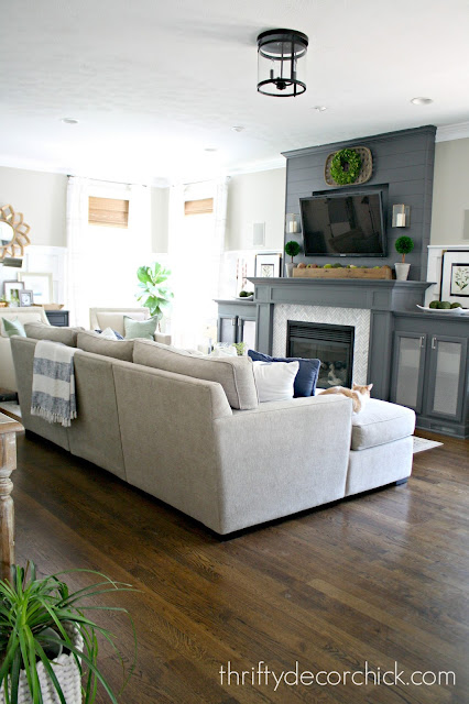
Anyway!! We are obsessed, in love, totally adore the new sofa. I went much lighter in color and it's got a much smaller profile. I LOVE IT. We lost a "seat" at the end that's now a chaise, but we don't miss that at all. I love being able to stretch out on the chaise and that it's open at that end.
When we knocked down the wall in this room years ago we didn't buy new furniture to fit the space, so it's been nice to finish it with items that work perfectly in the room. It's a long room and the seating area is narrow so this set up works so much better! I'm so happy with how this has all come together -- it feels serene and pretty. I'm in love with this space!
Here's how the room looked after the renovation:
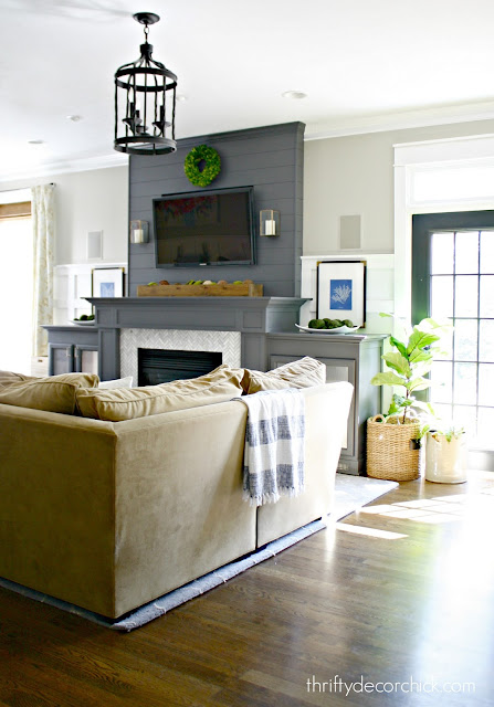
The first thing I did in here was taking the rug from the library and moving it in here. It's much smaller than the old blue one and fits this room so much better!
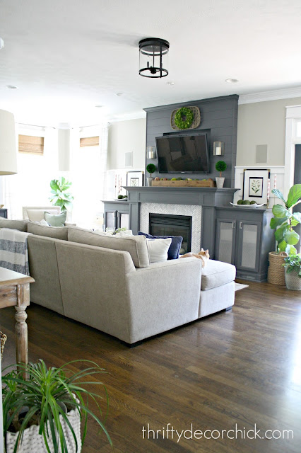
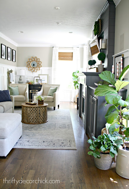
Here's a look at that same view now:
Funny how a smaller rug makes the room feel so much bigger! The new sofa with the lower arms helps open it up a ton too!:
I changed out that light last year -- it was hanging a little too low for the room:
It's a flush mount now and matches a light in our foyer as well:
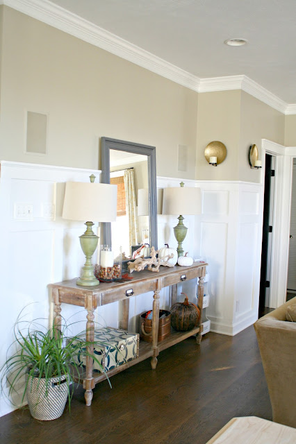
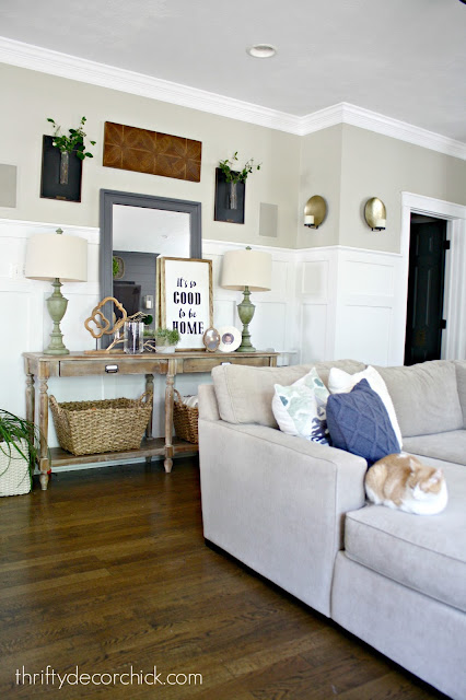
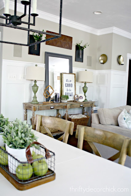
Over the past couple of years I've added to the this wall with the table -- here's how it looked right after the reno:
And here it is now:
I'll source all projects at the bottom if you're interested in anything you see!
I love those hanging vases from the Magnolia line! I love that pop of black on the wall:
The room used to be split down the middle with a wall and my office was back where the windows are. This was how this view looked when we finished that project:
I used to use that chair in the corner for my "office" -- I'd pull up a side table and work:
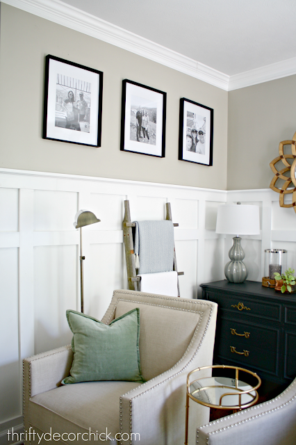
I finished the office/loft last year so I didn't use it anymore, and it made more sense to have additional seating centered in the room:
Those frames have hung for months with stock photos. ;) I just got these printed out yesterday!:
I've been pulling in more green in the room to break up my blue obsession. ;) I added some green pillows and of course the plants add some warmth. I just love how calming the grays, greens and blues are together.
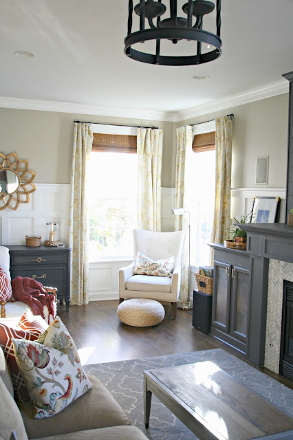
I love this corner! I loved having this little spot over there, but I love having the chairs closer to the sofa even more. Here's the "old" corner:
And here it is with my DIYish drapes hung much higher! Funny, but bringing the furniture closer together makes the room feel bigger! I love that there's some open space to let the room breathe a bit:
Here's a view the other way, towards the kitchen. Check out the old cabinets! :)
I finished the reno in fall so the room was decorated in warmer tones. I bring those back in the cooler months but for spring and summer I love the lighter look, and you know how much I love my blues!:
So far we are loving the sofa -- I didn't go with down filled cushions this time and so far so good. (Even with the dog sitting on the back!) I'll let you know how it holds up.
I hope you enjoyed the before and after pictures, you know they're my favorite!! I've linked sources and projects below -- if I forgot anything please let me know! As always it takes me years to get to a "final" in a room. I just have to live with it to figure out my plan and when I do that, I'm always happy with the result.
Have a great weekend and I'll see you next week! :)
Sources and project links:
It's good to be home DIY sign
Board and batten tutorial
Lighting sources
Coffee table, hall table: World Market
Paint colors
Side chairs
Black Magnolia vase art
All pillows: Target and HomeGoods
Window treatment source and how to make store bought drapes custom
Rug name and link
Candle holders: Target
from
http://www.thriftydecorchick.com/2017/06/mini-family-room-makeover-complete.html











No comments:
Post a Comment